Sunday, 20 October 2013

Reflecting on the exploratory stage

The exploratory stage has been really interesting; never before have I tried out so many different processes and disciplines in art in such a short span of time. It was also really great to be able to relax and engage a bit more without the worry of everything going towards a project which my future depends on- my Pre-U project last year stressed me out a lot.
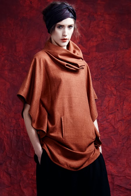
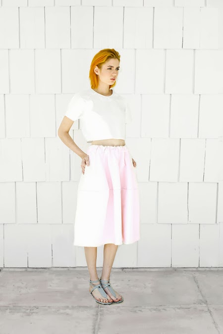
 The week that really surprised me was fashion- I was slightly dreading the week after having finished both the weeks I was interested in (Graphics and Lens Based Media) but to my surprise I found it quite fun! I think it may have taught me more things to apply in my photography than even the Lens Based Media week, I now should hopefully feel more confident when deciding how I want my model to look in a portrait shoot. I also got some compliments out of the tutors for my work in the week, which was great to hear.

Through the six weeks I think I learnt to be a bit more ‘free’ with my art and learnt to just experiment, not worrying if things go wrong. This should enable me to ‘think outside of the box’ a bit more to create better original ideas.


I feel like it was definitely the right decision to do a foundation course instead of jumping straight to degree as I was initially going to take Graphics, whereas now I have decided that Photography is a more appropriate path for me to take. The rest of the year should be very beneficial too as I can try my hand at the moving image- something which I have not myself tried out before but already have an appreciation of. I’m also keen to try and learn more about storytelling and how to apply that in my photography- I reckon that could take my photos from being just pretty pictures to having meaning and purpose.

Tuesday, 8 October 2013

Software Skills


Today we carried out a project to create a poster for a future exhibition/film/book etc that we would have in 10 years’ time. We had to use the three main Adobe design applications- Photoshop, Illustrator and InDesign

I have to confess the day wasn’t the most exciting day ever as I am already very experienced using Adobe software- I use it every day. Most people were newbies to the software and thus the class was aimed at teaching very basic skills.
I did actually get a chance to go up the front to teach the class something though. It was about using the colour range tool as a means of removing backgrounds from photos while keeping hair edge detail intact, it was a more efficient way than the way which was initially taught. I also went around and helped out a few people around the class.

We used Photoshop to composite a photo of ourselves into a found background image of our choice- I made sure to colour grade the photo of myself to match the background and give the poster some synergy.

Our posters now needed a logo, so we headed over to illustrator to try out a few different designs. I experimented using my name or just my initials and playing around with font and shape.
The final design I settled on was where I placed the S inside of the G to create a new shape.

The final task in InDesign was to bring the logo and image together with 200 words we were to write about our future work. I am terrible at writing things so I settled with the design quite quickly but sat for quite a while facing an empty word document. It wasn’t until I got home before I finished off the writing.


I had a quite nice to talk with the tutor, Anna, during the day about cool ways of doing things that I’d found in Photoshop. I recommended she check out Phlearn, a really great YouTube channel with more advanced photography and Photoshop tutorials.

Monday, 7 October 2013

Academic Writing- Exhibition Review

Today we visited the Tate Modern with the aim of writing a review for one of the rooms in the gallery.
For the reviews we had to consider how the room was laid out, why specific artists and pieces of work were put together, what was conveyed by the room and many other things.

To be honest most of the gallery was uninspiring, most of the photography was quite bland, the sculptures were weird as usual and nothing really grabbed my attention.
This carried on until I came across the rooms by Dan Flavin.  As a photographer who enjoys the physicality of light I was excited to find an installation using light as the medium. It reminded me of the ‘Light Show’ exhibition I went to at the Hayward Gallery which explored the qualities and possibilities of using light in installation- definitely my favourite gallery I’ve been to. I loved how the light interacted with the people walking through the rooms- they cast shadows on the walls and caused the room to subtly change colour due to the different amount of each colour mixing together. The light fixtures were softly reflected in the white walls and floor creating a very calm, ambient atmosphere. Unfortunately these rooms were not on the list of rooms we could review, so I had to settle for something else.

I ended up picking the room ‘Facing History: Leon Golub and Sarkissian’- you can read my review below.


Facing History: Leon Golub and Hrair Sarkissian

Facing History, a part of the Transformed Visions collection at the Tate Modern, aims to ‘confront the violence and atrocities of contemporary war and civil society’. The painting Vietnam III by Leon Golub and the series of photographs Execution Squares by Hrair Sarkissian face each other on opposite walls.

As you walk in to room the contrast between the artwork on the two facing walls is apparent. On the first side you see there is a very visual, intense portrayal of violence and war from Vietnam III. This is illustrated by both the content of the image- men are wielding rifles, people are running around with shocked expressions- and also the rough, tossed texture of the marks that are used to create the image.
The wide format of the painting with the subjects pushed to each edge of the frame produces a very strong composition with conflict between the gun-wielding soldiers on the left and the fear-stricken innocents on the right.

The other side of the room is a very different story- there are no panicked people running around, no fights, gun shots or in fact any visible violence at all. Empty streets are the only things that populate the second wall, Execution Squares. The absolute silence and emptiness is quite eerie and makes the viewer wonder about what might have happened before these photos were taken. The imagery of violence and war in Vietnam III on the opposite wall suggests that the streets in Execution Squares may have had a violent past despite the lack of any visual evidence. In actual fact ‘the images were taken in three different cities in places where public executions had taken place’.
‘Sarkissian’s first personal experience of an execution was as a child when he passed one of these squares on his journey to school and saw three bodies hanging in the street.’
The ability of the photographs to provoke a response is thanks to how the perspective, format and focal length are used to mimic what the viewer would see through their own eyes if they were there.

The two pieces really work well together and play off each other to create an impact on the viewer by contrasting graphic violence and deathly silence, two very powerful means of communicating the same issue. Sarkissian’s work could almost be seen as the aftermath of Golub’s painting, or possibly the calm before the storm.

This is a room well worth checking out.


Fashion Research


Electric Feathers


·         Background compliments outfits
·         Same consistent colours, patterns, materials
·         Very draped look- casual but yet elegant
·         Texture of background contrasts with smooth quality of material
·         Causal, relaxed but confident pose
·         Slight multi-cultural feel

Jasmin Shokrain


·         Again consistent colour, material
·         Location of blue/white/pink is shifted around on each outfit
·         Orange hair compliments the deep blue material
·         Very straight-up poses- what you see is what you get- simplicity

Ulyana Sergeenko


·         Less casual- more elegant
·         All quite curvy- pinched in at the waist
·         High waistline emphasizes length of legs
·         Formal grey spectrum used- smart

·         Each outfit has some sort of subtle pattern

Fashion Day 3


Today our task was to create a final garment which would be worn and photographed at the end of the day.

I decided to refine the skirt design I made on day 1 as I think it worked very well. I loved the shape and volume of the garment- it was almost like a wedding dress. I could imagine it being worn in an environmental portrait in the middle of a field or other open expanse- the feathery, layered quality of the skirt would blend in with the surrounding grass.

As this had to be wearable I started off by making two bands to hold the garment up on the mannequin, one for the waist and one for the chest. I used the same process as the first day to create the pieces for the skirt- I then attached each piece to the waist band using staples. I made sure to make a good number of pieces to give the skirt enough volume to create the look I was going for. Next I cut small pieces of paper out to cover up where I had attached each of the skirt pieces to neaten it up a bit.
I then decided to get rid of the chest band, I had initially thought of making it into more of a dress but then felt that the skirt would work well without any extra bits- keeping it simple.

My model was Qandeel who was very cooperative despite the skirt being much too girly for her liking! Whilst taking photos of my garment I also took photos of Qandeel’s dress on Evangeline as she couldn’t take the photos herself. Evangeline was also wearing her crown.

I was quite pleased with how the photos turned out even though Qandeel was perhaps not the type of person I had intended the skirt to be worn by- Evangeline would have actually been more like what I was looking for but obviously she was modelling Qandeel’s garment already. I reckon if I did something similar in future I would make sure to spend more time thinking about the model I would pick (and asking in good time before everyone is taken).

My favourite photos were when Qandeel and Evangeline were sitting in the circular windows- I love the super-soft backlight you get from the large light sources. It was especially interesting when facing away from the windows and light would fall on each side of the face but would leave the centre in darkness- this helped define the curvature of the face better and helped separate the subject from the background.

 
I have to say I quite enjoyed the Fashion week even though I don’t have any particular interest in following the pathway myself. There were many concepts and processes we went through that I felt I could apply within my photography and other work. It also gave me a bit of an insight into the fashion industry which will be useful as being a photographer I will inevitably be working with people from the fashion industry during photoshoots in future.

Fashion Day 2


Our tasks today were focused on the design aspect of fashion- we would be working on smaller scale 2D images to experiment without the limitations of what is easily accomplished in 3D. We carried out various tasks which would involve using and taking inspiration from the magazine cutouts we brought along.

After we had made an assortment of designs we used the photocopier to enlarge them- we then cut out shapes of different outfits from them. This created some new interesting textures which could inspire new garments.

I think it’s quite a cool way to work- you can create new textures, patterns and designs by playing with the scale of things, rearranging and cutting them up.

Fashion Day 1


To start off the fashion week we were given a task to create a few small samples of different ‘forms’ (not thinking about anything wearable in particular at the moment) which we would develop later to from part of a garment. These samples were to be inspired by what we had done in the previous week. I referenced some of the photographs I had taken for the processes or forms I would use.

Next we had to create multiple enlargements of a single sample using the same idea or process. I chose the sample that was inspired by the structure I created in 3DD to support the water bottle. The process of enlarging created new forms as paper on a larger scale became more flexible and loose. This made my forms look more draped rather than rigid and structural. I felt this change might suggest that the forms could be used to make some sort of skirt or dress.

After everyone had finished creating their forms we grouped up and got mannequins ready to start assembling an outfit. Our group had already come up with some good ideas of how to use our forms to create a garment. We were all ready to start but to our surprise we were all told to drop our things and move to another mannequin- we were then given the task of using other people’s forms to create a garment, not our own! This was quite a cool activity as it made us think on our feet a bit and work with forms that we may have not been able to come up with.


It ended up that I preferred the outfit made with our original parts, when we finally got around to using them, but we were definitely able to create some interesting garments using other people’s forms too.